ShopDreamUp AI ArtDreamUp
Deviation Actions


Suggested Deviants


Suggested Collections


You Might Like…


Featured in Groups

Description
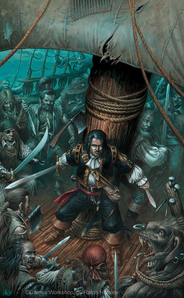
Savage City
Acrylic; approx 8.5" x 13.5"
Novel cover for the Robert Earl book of the same title.
© Games Workshop
Original artwork sold.
The swashbuckler hero and his sidekick stand back to back against the mainmast as their enemy mass around them.
Insurmountable odds? I think not!
The focus of the cover very much needed to be the hero. I tried to achieve that a number of ways throughout the composition and rendering.
The hero is the only figure looking directly out of the picture, whilst all the other characters are very keenly focused on him. I reinforced this effect by the colour scheme. The Hero has the strongest value contrast, blacks and whites, along with the colour contrast of being in a red-brown spotlight against the aquamarine surroundings.
The sail was left as a blank expansive area so that the title could be placed there.
Lastly his knowing smile tells us what he thinks about his predicament.
Image size
626x1010px 187.1 KB
© 2007 - 2024 RalphHorsley
Comments158
Join the community to add your comment. Already a deviant? Log In
Awesome artwork, as always.
Love the composition and the green ghostly background !
Love the composition and the green ghostly background !